City Pups
A Modified Google Sprint

Setting the Scene
Background:
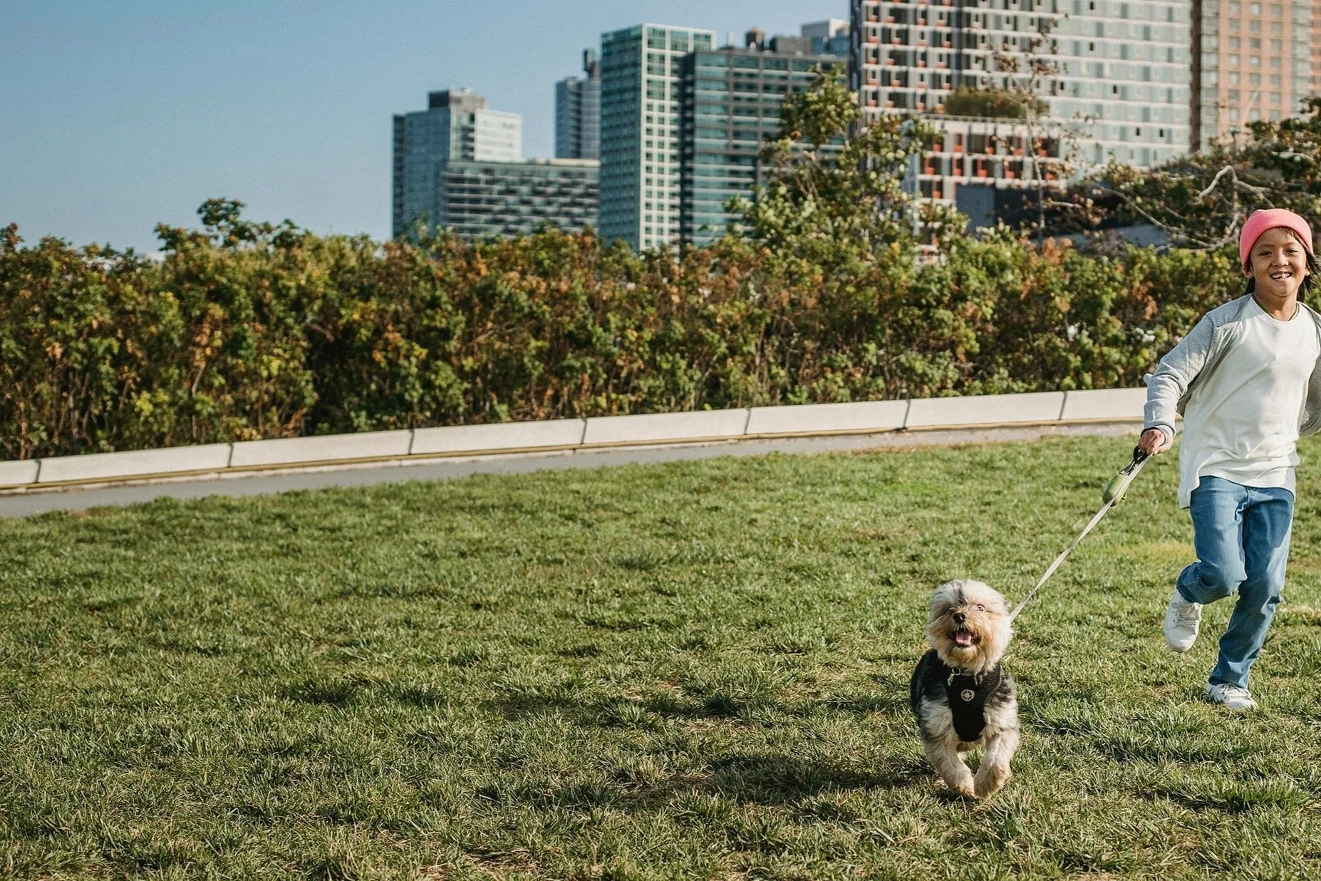
CityPups is a web app that helps prospective dog owners find their ideal match by analyzing both their lifestyle and the needs of the dog. Finding the right dog isn’t just about personal preference—it’s about ensuring both the owner and the dog are well-suited for each other.
Adopting a dog is a big responsibility to take on. Naturally, it is important that when you decide you are ready for that responsibility you should put in as much work as possible to find the right dog for you. Unfortunately, finding that perfect fit can be a very arduous and time consuming process. There are so many factors to consider when adopting a dog, and the number of considerations only increase if you live in a big city. Those who live in a city have often must account for unique living spaces, unusual transportation requirements, hectic schedules, limited outdoor space, and many other city-specific factors.
My Role:
To tackle this problem efficiently, I used a modified Google Ventures design sprint in collaboration with BiteSize UX, which provided the problem, preliminary research, and the name for the solution—CityPups. It was up to me to analyze and expand upon their research to help design a web application that specifically helps those who live in a city find their perfect pet.
Client
CityPups
Timeline
1 Week: February 20 - 25, 2025
Role
UX Designer & Researcher
Primary Deliverables
- Sketches & Wireframes
- Storyboarding
- Prototyping
- Usability Testing
End Goals:
Create happier owners
Find better forever homes for dogs
Increase the adoption success rate
Constraints:
Solution must be a desktop web app
Dogs must come from local shelters or organizations, not breeders
CityPups matches users with dogs, but adoption legal paperwork is handled by a third party
Day 1: Understanding the Problem
Analyzing the Existing Research
After reviewing summaries from 10 different interviews, I found that existing adoptions services have two key shortcomings in regards to facilitating adoptions that are a good fit not just for the adopter but also for the pet.
-
Space requirements — living spaces are much smaller in city environments
Activity levels — breed stereotypes are unreliable assessment of a dogs personality and energy levels
Comfort level in loud environment — cities are inherently loud and potentially overstimulating for dogs
Distance & Travel — most city dwellers do not own cars and as such make frequent use of public transport like the subway or the bus
Noise levels — noise levels are key for city dwellers that live in shared or close quarter apartments
-
Most adoption sites focus too much on creating an emotional connection between adopters and the pets. An emotional connection is important, however emphasizing it too heavily often results in adopters falling in love with pets that require more space, attention, or activity than they can realistically provide.
When this happens, the best-case scenario is that the adopter walks away disappointed and more uncertain about their ability to own a dog in the city. In worse cases, they adopt a dog that isn’t the right fit, leading to an unhappy living situation for both the owner and the pet—often resulting in the dog being returned to the shelter
Map
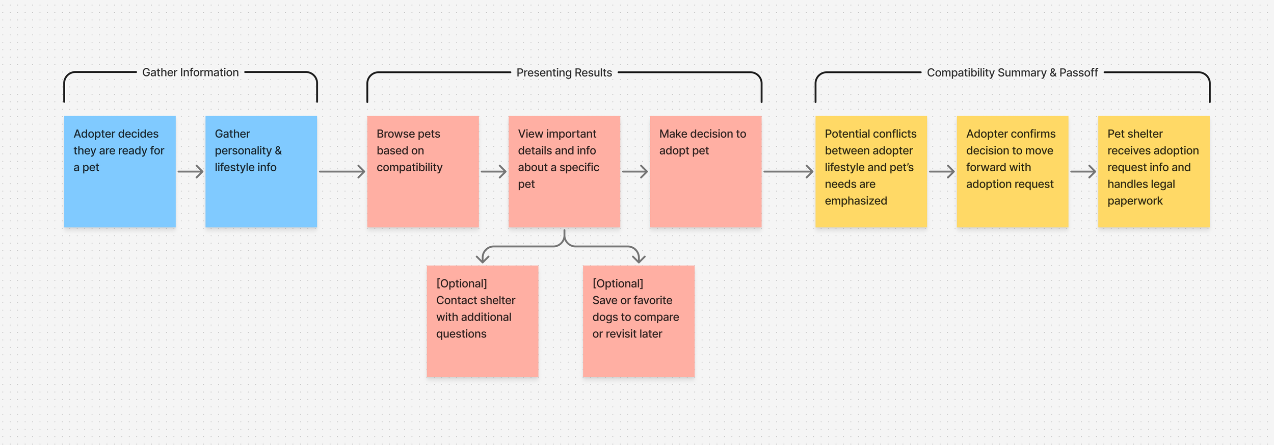
Based on my research, I created quick mockups outlining possible end-to-end user experiences within CityPups. A key factor in matching adopters with the right dog is understanding their lifestyle, routine, and living arrangements. The most viable way to achieve this in a web app is through a personality and lifestyle survey. While some users may hesitate to take surveys before using a service, our prior research suggests that people are willing to invest time in finding their perfect dog.
With this in mind, my mockups included three main sections:
Gathering information
Presenting the results
Highlight compatibility and pass along information along to shelters
Day 2: Additional Research & Sketches
Modified Lightning Demos
Adopt a Pet Takeaways:
Search radius is too large: the smallest option is 35 miles, too broad for urban adopters that rely on public transportation
Effectively displays popular filtering methods, however it lacks specific considerations for city dwellers.
Well-designed dog listing layout that prioritizes images.
Thrive Market Takeaways:
While unrelated to pet adoption, this quiz effectively gauges user preferences, including values and causes they care about.
A similar approach in which adopters are asked about their living situation and preferences could help CityPups create stronger matches between between adopters and potential pets.
Zillow Takeaways:
Both dog adoption and homebuying require lifestyle compatibility: users need detailed info and high-quality visuals before committing.
Zillow’s layout and content structure offer a strong potential model for CityPups.
Crazy 8’s
Crazy 8 Sketches:
With a clearer vision for displaying information in CityPups, I used the Crazy 8’s exercise—a rapid ideation technique from design sprints. The goal was to sketch eight variations of what I imagined to be the most crucial screen in the user experience. I chose the browsing page, as it’s where users will spend the most time and make key adoption decisions.
Sketches 1-8
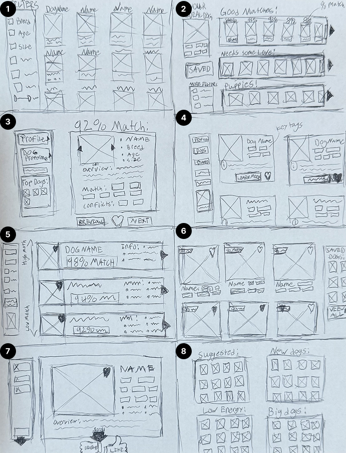
3 Frame Solution Sketch
I reviewed and combined the best elements from my 8 sketches into one cohesive design.
This design was then put in context via a three-panel board, showcasing the critical screen—the browsing page—along with the two screens that follow it. This structure ensures a seamless user journey by contextualizing how the user would proceed after selecting a dog they are interested in.
Images remain the focal a point in the design until the final step. Before a user submits their request to adopt a dog, they are forced to review all factors that might make the pet a good or bad match. This approach balances emotional engagement with responsible decision-making.
Day 3: Storyboarding
14 Panel Storyboard:
I created a 14-panel storyboard to map out the overall user journey, which helped me make key design decisions.
Taking inspiration from my earlier lighting demo of Thrive Market, I included a matching quiz for all new users in an effort to reduce the frequency of mismatched pets and owners.
One major takeaway I got from completing this storyboard was that the matching quiz at the beginning would need to be fairly long to gather all necessary information.
Moving forward I knew one of the key insights I would need to test for in my usability tests would be how much is too much? We want to ensure our users get the best match, but we do not want onboarding to be so long that they abandon our service all together.
Day 4: Prototyping
Sketches > Low Fidelity > High Fidelity
Low Fidelity Mockups
Onboarding Quiz:
The onboarding quiz asks users questions about their lifestyle, not just what they want in a dog. It’s designed to reflect what a dog might want to know about its future owner—like living space, schedule, and activity level—rather than focusing on preferences like breed or size. The goal is to keep the quiz simple and encourage honest answers, helping ensure great matches without making users feel limited. Dog-specific filters are saved for the browsing results page to keep the quiz short and avoid drop-off, while still allowing users to refine their preferences later.
Comfortable with the Low-Fidelity layouts, I began turning the screens into high fidelity mockups. Unfortunately, as expected in a sprint, time is not on your side. So the key here was working fast enough to complete all the screens while still designing with a level of quality that would make for an effective prototype when I began usability testing.
Prototype
On day 4, I began translating my storyboards into low-fidelity wireframes to refine the layout of key information. While designing the adoption request confirmation screen in Figma, I realized the original layout in my sketches wasn’t linear—information was spread across the screen, making some details easy to overlook.
Review & Confirm Screen
This screen is critical as it provides adopters with an overview of potential benefits and conflicts with the dog while also confirming their personal details and survey responses sent to the shelter. Since shelters rely on this information to assess adopter suitability, accuracy is essential.
To improve clarity and ensure users don’t miss key details, I restructured the layout into a vertical format, guiding users through each section as they scroll.
High Fidelity Mockups
Browsing Matches:
After completing the quiz, users are instantly shown dogs that match their lifestyle. Each pet card includes tags that highlight how the pet’s traits align with the adopter’s needs and preferences. Users can also fine-tune their results using filters along the left side of the screen. Clicking on a pet reveals more details—like personality, traits, location, and any potential lifestyle conflicts—so adopters can make informed, thoughtful decisions.
Submitting an Adoption Request:
After the extremely difficult task of choosing just one adorable pet, users are shown a summary screen that once again emphasizes how the pet’s traits align—or don’t—with their lifestyle. This info isn’t just for the adopter; it’s also sent to the adoption center to help them assess fit. By sharing this context upfront, the process becomes smoother and faster for everyone involved.
Day 5: Validation
Usability Tests
On day 5, I started user testing with my prepared question prompts and five participants scheduled throughout the day. Each of the interviewed participants met key criteria: living in a big city, having a strong affection for animals, and possessed some prior experience with dog ownership or cohabitation. These qualities were essential for gathering insightful and actionable feedback.

Test Insights:
Survey Length: Participants willing to invest 10–15 minutes in a survey if it leads to better matches, as they already spend significant time browsing without success.
Survey Confirmation: Users want a final review of their answers with explanations on how responses impact results.
Tag System Clarity: Older participants found the match tags (green/yellow/red) confusing, suggesting the need for a brief tutorial, an explanation screen, or a revised system.
Adoption Process Transparency: Clarify that CityPups only facilitates matching and does not complete the adoption process.
Conclusion
Design sprints can feel like a race where constant speed is necessary, but it's important to remember that pacing is key. Some phases require intense pressure and quick decisions, while others allow for a more measured approach as long as progress continues. Instead of focusing on speed alone, I found it more effective to prioritize swift decision-making over rushed execution. For example, I usually like to spend more time exploring different ideas, but in the sprint, I had to commit to one and move forward.
I would definitely say that one of the biggest things I gained, (besides of course my realization that I really want to adopt a dog of my own) is confidence in making bigger design decisions with less deliberation. Despite the limited time, I was impressed with how well the prototype product came together and the strong positive feedback expressed by participants.