
RecipEZ
End-to-End Mobile App Project
Setting the Scene
Background:
Each year, households in the United States generate over 89 billion pounds of food waste which accounts for a shocking 43% of the country's total food waste. This translates to over $335 billion in food waste each year. As someone who is passionate about the environment, I began to wonder why there aren't more convenient tools available to help people reduce their food waste?
The Challenge
I set out with the original goal to create a mobile app that directly tackles food waste, however I quickly realized that the reason food waste has remained such a large issue is not due to a lack of available solutions, but rather to the inconvenience associated with changing our habits and routines. Most existing solutions require people to alter their routines without making the rewards to these changes easily understood, and as a result people fall back into the wasteful habits they are used to.
Project
RecipEZ
Timeline
October 2024 - February 2025
Role
UX Designer & Researcher
Primary Deliverables
- User Interviews
- Style Guide
- Accessibility Audit
- Sketches
- Low & High Fidelity Wireflows
- Prototypes & Usability Tests
End Goals:
Make cooking at home easier
Reduce food waste
User retention through value
The Question
-
Solution:
I developed RecipEZ, a mobile app that streamlines meal planning and pantry management to help users cook efficiently and waste less food. The app functions as a virtual pantry and recipe finder, allowing users to track their ingredients, receive expiration reminders, and quickly add items using AI-powered scanning. Its smart recipe feature suggests meals based on available ingredients, helping users avoid unnecessary grocery trips and prioritize expiring foods. Additionally, RecipEZ provides waste-tracking insights, showing users what they discard most often and estimating the financial impact of food waste, ultimately promoting more mindful consumption habits.
Research & Discovery
Interviews
In order to improve the at-home cooking experience, I needed to figure out what my typical user might look like and then identify areas in which I could provide value to these users. To begin, I sent out a screener survey to identify ideal participants, and then narrowed down 5 participants to conduct preliminary interviews. You can see my interview guide here.
Findings
From these interviews, I uncovered the most significant challenges users face when cooking at home, narrowing them down to 5 key pain points:
People cook at home to try and save money, but they often end up wasting money instead due to excessive food waste, buying duplicate items, or buying excess
It is very difficult to remember when things will expire
It is difficult to find recipes and then follow through on them
People tend to distrust many websites and recipe authors
Cooking at home often takes longer than it should

Empathy Maps
From my background research and my interviews, I was also able to identify two key user types and create empathy maps to help guide future design decisons.
College Student / Recent Graduate
Busy Parent
Process
User Stories
Overview:
With my user types and a long list of pain points from my interviews in hand, I moved on to developing user stories to help guide my ideas and ensure the actual issues would be addressed in the solution. The stories were ranked according to priority, value, risk, and time estimates.
Results:
37 user stories generated & ranked
20 MVP’s identified
App Map
Overview:
I organized the MVP user stories into logical groups and sub groups based on their relationships and how they naturally aligned.
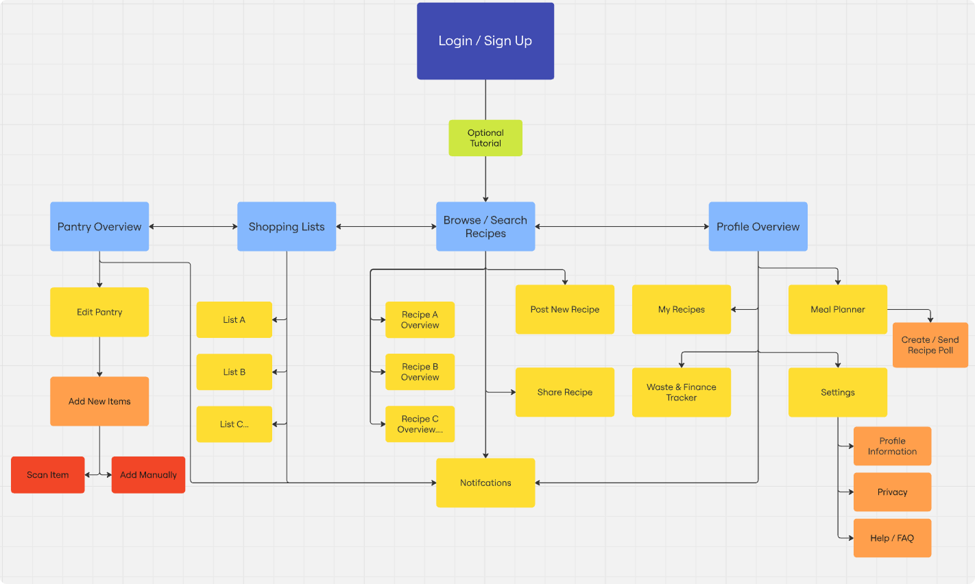
Results:
Four main groups emerged; pantry, lists, recipe browsing, and profile sections of the app.
Sketches
Bringing The Idea To Life
With the app's MVP features and general organization laid out, the next step was to bring these features to life visually via sketches. Although each screen and section of the app posed their own unique challenges during my first sketch iterations, the most tricky parts came from the pantry and the recipe explore pages.
Pantry Sketch
Challenge:
How can the virtual pantry provide similar levels of intuitive organization as a traditional pantry and fridge, while making expiration information available at a quick glance?
Approach:
Organize the items into various logical categories. Allow each category to have indicators alerting when any of its contents are about to expire or have already expired.
Approach:
Based on my research and interview findings, I organized the information into three main sections. First, the browse view presents essential details like an image, title, rating, and cook time for quick decision-making. Second, the quick info page offers a deeper look, including more images and videos, a description, ingredients, cooking supplies, and reviews. Finally, the full recipe page provides step-by-step instructions for cooking the dish.
Challenge:
Balancing information on the recipe explore page was a key challenge. Too much detail at once could overwhelm users, while too little would leave them unable to make informed decisions. The goal was to present the right information at the right time, streamlining the decision-making process without causing frustration.
Guerilla Tests
Getting a Quick Pulse Check
Before proceeding to mid-level mockups and wire flows, I conducted a few guerrilla usability tests on my sketches with strangers and then based on my findings, I incorporated a few improvements into my digital mockups below.
How to Add New Items Unclear:
It was unclear for first time users how to add items to their pantry, so a secondary larger button with copy text explaining its purpose was added, making it it more clear what step a new user should take next.
Custom Item Notes:
Notes section added to the item info screen after users reported that they wished they could add notes about specific products to remember in the future.

Added “Pantry Only” Toggle:
Users were unclear whether or not the recipes shown would be automatically filtered according to their pantry contents and wanted a method to disable this feature in case they felt like exploring recipes without any restrictions so a toggle switch was added.
Hinted Overlays & Explanatory Text:
First time users were confused by the purpose of the content sections within the profile page so explanatory info was added to clarify and a faded image of what one would expect to find there applied to hint users at what they could expect.
Wireflows:


Design & Accessibility
Moodboard
Style Guide / Brand Imagery
Accessibility Audit
Overview:
Although design and aesthetics are important, I first wanted to make sure that my designs met WCAG 2.1 accessibility standards. I selected a few screens from my wireframes to transform into high-fidelity versions, and then conducted an accessibility audit.
Adjustments Made:
Color pallet adjusted to meet WCAG standards
Minimum text size increased
Icon sizes and button padding increased
Visual feedback added to buttons and forms via focused and pressed states
Validating
Prototypes
Account Creation:
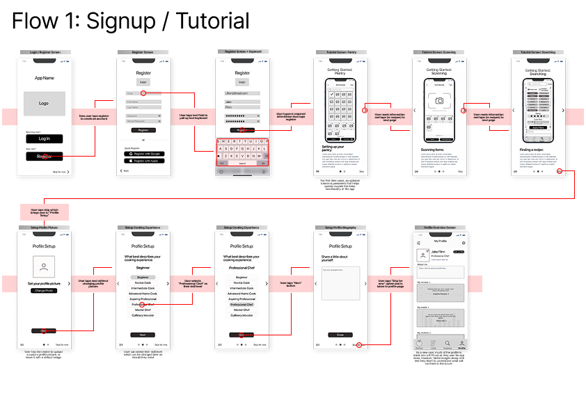
The profile setup was thoughtfully designed to accommodate a expected user types. A skippable tutorial offers flexibility—supporting more cautious users who prefer guidance, while allowing confident users to dive right in and learn by doing. Users can also choose their cooking skill level, from total beginner to culinary innovator, which helps tailor recipe suggestions to their comfort zone. Lastly, users are invited to upload a profile picture if they feel comfortable, as it helps build a sense of trust and community within the app.
Add Items to Your Pantry:
Taking the time to manually add items to a virtual pantry would be a big inconvenience and a huge deterrent from using the app altogether. A smart add feature that utilizes AI image recognition allows users to quickly add items by taking a quick picture after going grocery shopping, and in turn greatly reduce the barrier to entry of the pantry section in the app.
Edit Items:
The virtual pantry feature would allow the user not only to view the contents of one's pantry from anywhere, but it would also allow them to input and track crucial information such as expiration dates. Furthermore, the users could receive reminders on their phone when certain items are about to expire
Utilizing my prototypes, I conducted two rounds of usability testing split between 10 total participants.
Round 1:
Utilizing Figma's prototype feature, I created a clickable prototype for each of the red-routes and conducted two rounds of usability testing split between 10 total participants.
Findings:
100% Task Completion: All users completed 6/6 tasks successfully
Button Confusion: Confusion around button nomenclature and button iconography
Solution:
Buttons were reworked and reworded and when necessary, explanatory text or tip notifications were added.
Impact:
In the 2nd round of testing, the confusion was greatly reduced as participants completed tasks more quickly and with less hesitation due to greater confidence in the actions each button would perform.
Round 2:
With the more major issues addressed from the first round of adjustments, the second round of testing revealed much smaller and more cosmetic issues that should be addressed, although not critical when evaluating the functionality of the app.
Findings:
Smart Scan & Barcode Confusion – Users were unsure if scanning was required or if the smart scan worked automatically, suggesting a need for clearer instructions or a brief tutorial.
Recipe Filtering & Ingredient Matching – While appreciated, the filter tab was underutilized, and users wanted a clearer indication of missing ingredients when browsing recipes.
Discarding Items – Users wanted the ability to remove items from their pantry even if they were not expired, rather than only marking them as consumed.
Additional Features Suggested – Users requested calorie and nutrition information for pantry items, a clearer explanation of account benefits, and an option to scan receipts instead of individual items.
Solution:
The implementation of a guided first time user tutorial and inclusion of the additional suggested features would likely address these issues, however to confirm this I would need to conduct a third round of usability tests

Before


Before


After
In this example, you can see the screen prompt now offers more specific feedback and a red outline to indicate error status, and the “Add Manually” button was renamed “Search” to make its function easier to understand for users. Furthermore, a tip prompt was added to inform new users.
After

In this example, the iconography was switched from a barcode to a camera as users were incorrectly assuming every item needed to have its barcode scanned as opposed to snapping a picture of all the items they purchased.
Usability Tests
Browse Recipes:
The app’s recipe browsing section offers flexible filtering while eliminating common frustrations like ads, paywalls, and lengthy text. By integrating a virtual pantry, it also filters recipes based on available ingredients, reducing store trips and prioritizing soon-to-expire items.
Conclusion
Summary:
One big lesson I took away from this project was to trust the process—even when I felt tempted to dive into solutions right away, sticking to a structured approach gave me much better clarity and results. I also realized I tend to underestimate how long things actually take, so giving myself more realistic timelines (and a little flexibility) made a big difference, especially when waiting on things like interviews or usability testing. That said, I also learned not to get stuck in one phase for too long—like when I lost way too much time trying to perfect a prototype that just needed to be testable. Early feedback beats pixel-perfect design every time. And finally, even though this was a solo project, bouncing ideas off other people—friends, designers, anyone willing to listen—was incredibly helpful. A second pair of eyes (or five) can bring fresh energy and perspectives you didn’t know you needed.
TLDR:
Trust the Process
Jumping straight to solutions ideation can feel natural, but following a structured design process leads to clearer thinking and more effective outcomes—especially during usability testing.Set Realistic Timelines
Efficiency is great, but quality takes time. Build in buffer room, especially when dependent on external factors like interviews or user testing.Prioritize Progress Over Perfection
Don’t get stuck perfecting early-stage prototypes. Speed matters—early feedback is more valuable than polished details.Collaborate, Even Solo
Talking through ideas with others—designers or non-designers—sparked insights and kept momentum going. Feedback from multiple perspectives is invaluable.