
Eventful
Boosting Attendance Rates Among Socially Anxious Users
Setting the Scene
Background:
For this project, I was presented with a scenario in which a startup company, Eventful, had launched an event finding mobile app designed to create social experiences and help users meet new people. More specifically, the company is looking to help people that are new to a town or city overcome the fear and social anxiety that can accompany making friends in new places.
The Challenge
Within the startup, the business team identified a problem; the number of people who say they are going to an event is significantly higher than the actual number of people who attend. Based on the users location data, 20% of users actually follow through and attend the events that they sign up for. The company aims to improve the current experience and introduce new features that better support users—particularly those with social anxiety—in following through on their event commitments.
Restraints & Considerations:
The solution must be cost-effective for company
Users may need incentives to attend
The product manager has noted they suspect users may not be receiving timely communication about their upcoming events (ex. Emails, reminders, etc.)
The Question
-
Solution:
To boost attendance among socially anxious users, I introduced a Buddy Feature that matches people with similar interests so they can attend events together. It helps ease anxiety, adds accountability, and makes the experience more approachable. Buddies can connect, chat, and plan ahead, and if they show up together, they both earn a discount for future events—driving engagement and retention. I also added calendar syncing, reminders, detailed event info, and visibility into who’s attending to reduce uncertainty. The solution supports anxious users while staying cost-effective and scalable for the business.
Project
Eventful
Timeline
March 2025 - April 2025
Role
UX Designer & Researcher
Primary Deliverables
- Competitive Analysis
- User Interviews
- Sketches, Low, and High Fidelity Wireflows
- Prototype
- Usability Tests
Research & Discovery
To deepen my understanding of the industry, I began my research by conducting a competitive analysis to figure out what industry leaders in the space might be doing right, what they might be doing wrong, and how I could learn from this and apply it towards solutions to address Eventful’s attendance issues. The subjects of my competitive analysis include Eventbrite, Facebook events, and Meetup.com.
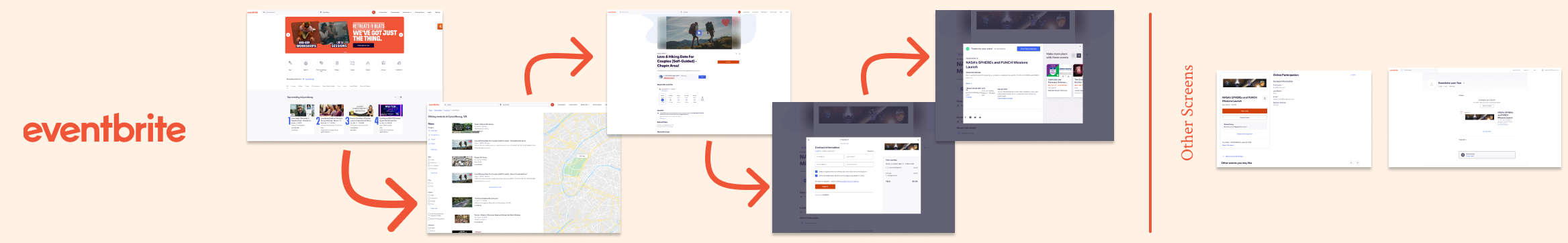
Weaknesses: Weak onboarding; no visibility into attendee count; minimal interactivity; lacks calendar integration.

Weaknesses: Relies on existing networks—challenging for newcomers; cluttered interface; misleading RSVP data; limited upfront filters.
Weaknesses: Paywall limits access; discovery tools are clunky; calendar UX is poor.

Takeaways for Eventful: Use location-based suggestions, build trust with refund transparency, display attendee data, and add interactive features like chat and calendar sync.
Takeaways for Eventful: Introduce RSVP tiers, visible upcoming events, improved friend-invite flows, and accessible filtering tools.
Takeaways for Eventful: Highlight attendee numbers, add chat features, improve onboarding for new users, and streamline event discovery.
Strengths: Smart auto-location and streamlined checkout reduce friction; clear refund policies build trust.

Strengths: Seamless social integration encourages group attendance; RSVP tiers (“Going” vs. “Interested”) offer clarity; proactive reminders and event visibility boost engagement.

Strengths: Focus on community and interests fosters connection; pre-event chat builds comfort; attendee estimates and sharing tools support follow-through.
Competitive Analysis
Findings
Event Discovery & Promotion: Users primarily find events through social media or Google. Personal invitations and trusted recommendations significantly increase attendance.
Barriers to Attendance: Common reasons for skipping events include forgetting, feeling unmotivated, anxiety, uncertainty about the event experience, and lack of accountability.
Accountability & Motivators: Attending with a friend, financial commitment (paid tickets), personal invitations, and social expectations (e.g., coworkers inviting them) are strong motivators. Free events often lack commitment incentives.
Pre-Event Comfort: Users want to know who else is attending (age, demographics, newcomers vs. regulars) and prefer an opportunity to interact with the host beforehand.
Building Confidence: A positive first experience at an event increases the likelihood of future attendance. Events explicitly designed for newcomers are more approachable.
Desired Features:
Reminders & Calendar Integration to reduce forgetfulness.
Attendee Insights (e.g., knowing names, demographics, or attendee types).
Transportation & Parking Info to ease logistical concerns.
Event Reviews & Host Ratings for credibility and reassurance.
Social Features (e.g., chat with attendees or hosts pre-event).

Interviews
With a better understanding of the competitors on the market, my next task was to dive into gaining a better understanding of the potential users that Eventful might have. To do this I conducted 5 interviews designed to help me answer the questions below. My script can be found here.
Interview Goals
How do socially anxious individuals discover and engage with events in a new city?
What prevents people from attending events they've signed up for
What successfully encourages people to attend events they’re hesitant about?
What kinds of support or information can reduce pre-event anxiety?
Which incentives would actually drive attendance for this user group?
Persona
Utilizing the existing research provided by Eventful combined with my own research, I created a persona representing the main archetype Eventful is trying to help, the anxious introvert that is moving to a new location.
Getting Organized & Ideating
User Stories
Overview:
With a solid persona and a lot of information from both competitive analysis and interviews, I was ready to transform the various pain-points and needs into user stories.
Results:
36 user stories generated & ranked
21 MVP’s identified
User Flows
Overview:
After reflecting on the interviews and the resulting user stories, it became clear that pre-event anxiety, as well as a lack of accountability were the two biggest factors contributing to the decrease in attendance followthrough. Conversely, interviewees reported that attending an event with a friend and being provided sufficient event details prior to the event were some of the best ways to create both comfort and accountability in users with social anxiety. Knowing this, I proposed both the addition of a buddy feature as well as a redesign of the event discovery and sign up process to the app. The goal is to provide socially anxious users who are new to a city or area the opportunity to meet other newcomers within the app and then attend events together, helping to foster accountability and ease the anxiety of attending an event alone.
Results:
Three main flows: Login & Signup, Finding a Buddy, and Finding an Event.
1. Log In / Sign Up

During the signup process, users are introduced to the buddy system and presented with the opportunity to opt in and be matched with buddies near them based on personal preferences.
2. Find a Buddy

The process of finding a buddy first requires the user to have completed both their own profile as well as their buddy preferences in order to ensure they get the best matches. From there the user can explore their matches, what they have in common with them, and reach out to anyone they think might be a great friend.
3. Find an Event

There are three important things I kept in mind when considering the event discovery flow.
First the user needs to have the ability to easily search and filter for the types of events they want. If they cant find an event they like, it doesn’t matter whether or not they have a buddy to go with, they aren’t going to attend.
Second, socially anxious users need to be provided with ample details about the event as well as an easy way to be reminded about their signup (calendar feature was missing from previous designs).
Third comes re-emphasizing and encouraging the user to invite a buddy to attend the event with them.
Sketches
Bringing The Idea To Life
With the app's MVP features and general flows laid out, the next step was to bring these features to life visually via sketches. Although each screen and section of the app posed their own unique challenges during my first sketch iterations, the most tricky parts came from the pantry and the recipe explore pages.
I selected the most promising sketch designs to move forward with in a guerrilla usability test at a nearby coffee shop.
Guerrilla Usability Tests
Pulse Check
Before proceeding further, I wanted to get some early feedback on my designs so I created low fidelity digital mockups and printed them out. Then I conducted 5 in-person guerrilla usability tests in a nearby coffee shop.
Positives
1. Buddy Feature: Users loved the concept and flow and imagined it being especially beneficial to those with social anxiety.
2. Event Discovery: Felt natural and intuitive, no major concerns uncovered
3. Add to Calendar: Including a highly visible button was very appreciated.
Painpoints
1. Event Access Confusion
Users unsure what “My Events” included (saved, hosted, attended, etc.).
Solution: Replaced visual cards with clearer static headers.
2. Cancelation Placement
Users expected to cancel from ticket details or order history.
Solution: Added cancel/refund options to both locations.
3. QR Code Visibility
Ticket QR codes were hard to find post-purchase.
Solution: Users now view tickets immediately after checkout.
Example of a change made in response to the guerrilla testing feedback. The updated flow for viewing ones ticket QR code after purchasing is more straightforward and ensures the user to view tickets directly after purchasing them.
High Fidelity Design
Style Guide / Brand Imagery
Grid Layout
Wireframes (version 1):
-
![]()
Log in & Sign Up Wireflow
-
![]()
Find Event & Purchase Ticket
-
![]()
Find A Buddy


Testing & Validation
Account Creation:
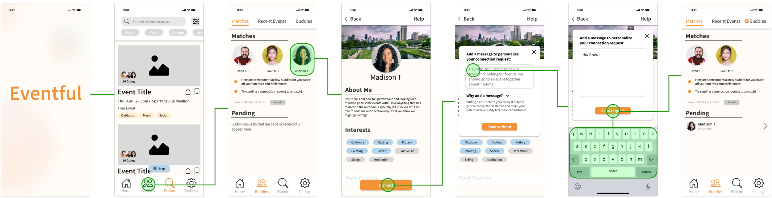
During the onboarding process, users begin with the standard choice between logging in or signing up. Within the signup process, users that opt in to the buddy matching process are taken through a series of screens where they input their own information and their ideal buddy preferences. After they confirm their profile details, they enter the home page of Eventful.
Prototypes
Find An Event & Invite A buddy:
To find an event, users can either view events recommended to them on their homepage, or search and apply filters from the explore page. Clicking on an event reveals more detailed information, including the attendees, host contact information, the event discussion chat, and helpful tips. During the checkout process, the user is presented with the option to receive email reminders and encouraged to attend an event with a buddy to receive a discount. After purchasing a ticket, they are taken to a ticket overview screen where they can easily add the event to their calendar.
Get Matched With A Buddy:
After entering their buddy preferences, users users can head into the buddy section where a selection of 6 new potential buddies are presented to the user every day. From here, the user can click on specific profiles to learn more about them, and if they see someone they want to reach out to, they can send them a connection request.
Utilizing my prototypes, I conducted two rounds of usability testing split between 10 total participants. The link to my test script can be found here.
Round 1:
Utilizing a Figma , I created an interactive prototype for each of the red-routes and conducted two rounds of usability testing split between 10 total participants.
Findings:
100% Task Completion: All users completed 6/6 tasks successfully.
Accessibility Concerns: Users reported difficulty reading certain sections due to small fonts.
Clarity Issues: Some confusion around button nomenclature and button iconography across multiple screens.
Cognitive Load: Some stages of the onboarding process presented too many questions at once to the user, resulting in slowed decision making.
Visual Emphasis: certain screens had unclear primary directions to guide the user in


Before


After
1. Accessibility & Clarity Issues
Increased minimum font size to 16 pt
Increased text/background contrast on certain buttons
Added progress bar during onboarding
Updated button copy for improved clarity
2. Progressive Disclosure for Buddy Onboarding:
Original onboarding flow presented too many fields at once, which some users found overwhelming and increased desire to skip the form
Utilizing progressive disclosure, confusion and cognitive load is reduced, translating to increased flow completion rates
3. Improved Visual Emphasis on Preferred Actions
Onboarding and buddy connection screens lacked clear visual emphasis on preferred actions, resulting in user hesitation or unintended actions.
Button layout and color updated to have clear preferred directions for user.
Usability Tests
Send a Ticket:
Share your ticket easily and intuitively either directly from the ticket details, or you by attaching it to a message within an existing chat.
Connecting After an Event:
After successfully attending an event, users will be presented with timely opportunities to connect with anyone they met at the event. This way, even if they forgot to get the contact information of a new friend they made, they still have a way to connect.
This feature also benefits as an alternative method of communicating for those that are anxious to give out their phone number or personal contact information.
Before

After
1. Added Chat Ticket Sharing
Half of the users in the test expected to be able to send tickets via the buddy chat function - similar to how they can send documents and images in messaging apps. Because of this, ticket sharing was added directly within chats to prevent any frustration and accommodate prior expectations that many users cary over from utilizing services like iMessage.
2. Recent Event Connections
Due to the page unintuitive location within the buddies section of the app, many users struggled to find and connect with people from recent events they had attended. To address this I removed the dedicated location within the app and replaced it with timely prompts and push notifications right after events—making the feature easier to discover when it matters most, without cluttering the app’s layout.
-
Removed dividing lines on profile screens to reduce visual clutter.
Added consistent page headers across all screens.
Aligned “My Events,” “My Groups,” and “Saved Events” icons to the left for visual balance on the homepage.
Improved buddy match profiles with more visible info (next iteration will add missing fields to onboarding).
Clarified ticket pricing by adding “ea.” to indicate price per ticket.
Changed “Sync Contacts” button to read “Invite from Contacts” to help user understand the process is not automated
Simplified event filter options to: Free, Custom, or Any.
Made the “New to Town” banner more visually prominent.
Implemented various minor visual and layout tweaks for a smoother user experience.
Round 2:
With the more major issues addressed from the first round of adjustments, the second round of testing revealed smaller as well as cosmetic issues that should be addressed, although not critical when evaluating the functionality of the app.
Findings:
Chat Ticket Sharing – Some users first tried to share tickets with their buddy by going to the chat feature rather than the ticket details screen.
Recent Event Connections – Users struggled to find the “reconnect with missed contacts” feature—it was buried in the Buddies tab, which didn’t feel intuitive. Most found it by digging through Past Events.
QOL & Cosmetic Improvements – In addition to the major issues that were uncovered from this round of testing, many smaller and more cosmetic issues were revealed. Below I have listed a few of the many small adjustments that were made based on the feedback I received:
Usability Test 2
Conclusion / Impact
Impact:
When asked how likely they were to skip an event they had signed up for, users estimated a 50% chance if they did not use the buddy system. With the buddy system, that estimate dropped to 20% — a 30% decrease in reported event skipping. While further testing is needed to confirm the actual impact, these results strongly suggest the feature is targeting the right problem.
Lessons Learned:
Keep Low-Fidelity Low:
On a long flight, I over-polished my early wireframes—turning what should’ve been quick sketches into refined screens. During testing, this misled users into focusing on aesthetics instead of layout or flow. Switching to paper prototypes fixed the issue and reminded me: low-fi designs set the right expectations and encourage better feedback early on.
Balance Focus vs. Broad Appeal:
I struggled with whether to make the Buddy Feature mandatory in onboarding. Requiring it reinforced the app’s value for socially anxious users (our core audience), but risked alienating broader users. I made it optional to support wider appeal—but this taught me how expanding too fast can blur a product’s focus. Future A/B testing would help strike the right balance.
Less is More:
Users suggested lots of extra features—profile ratings, verification, social linking, etc.—but most went beyond the app’s MVP goals. It was a helpful reminder: stay focused on the core experience. Extra features add complexity and cost, and can dilute the product’s purpose if introduced too soon.